Best Practice for making Snippets
This article is aim has people that have a technical minded, but are getting started in understanding the creating a HTML Email. We hope this help people to get basic understanding on best practice, and why emails display differently of different devices.
In this article we are looking at creating a basic Email Training document, I have used a great reference and added examples for you to use. The Reference is Vladmair Abadzhev, there is many best practice on the web, here is 10 of them
Top-Level Layout: Limited-Width Centered Content
In most cases, you'll want limited-width content on a desktop. On mobile devices, the layout should adapt to the small screen size.
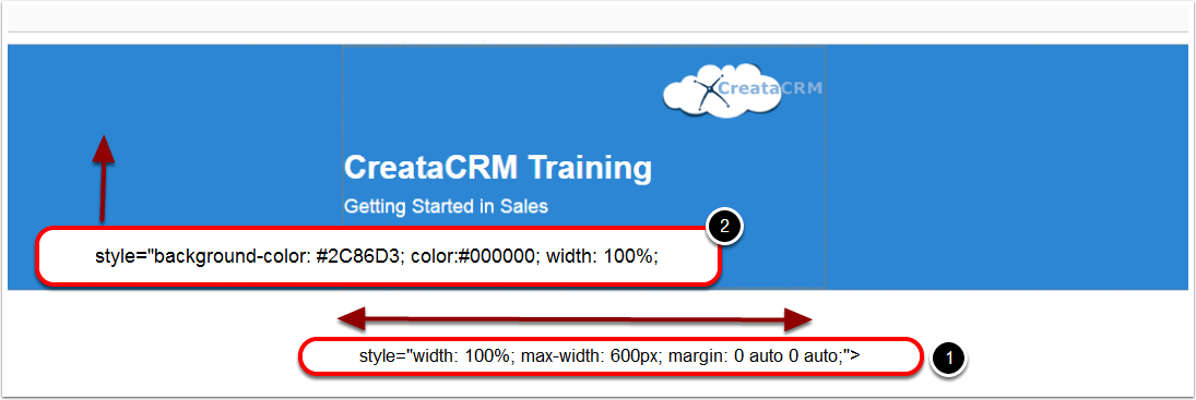
Desktop to Mobile
- Is for Desktop, 100% Width will make a blue background, This keeps a long blue background on header. If you made it Width = 600 px. This will only have as 600 px in the middle. I prefer in emails be Width = 100% for header and footer, as it looks neat. my opinion
- Padding = 20 px, display nicely with the mobile, So it is 20 px padding on the ouside edges, making it responsive layout.
Control Text and Image Layout with Paragraphs
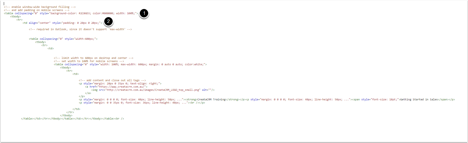
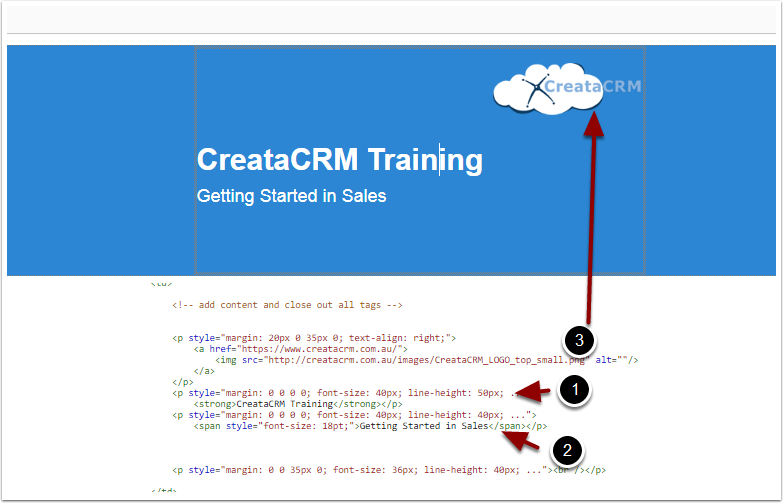
Here's the snippet from our Transactional email header. In addition to margin, note how line-height can help with layout management.
= 50 px Header CreataCRM Training
= 40 px in row size Getting Started in Sales
= Gives Margins to from logo to the images
To ensure that line-height behaves predictably in Outlook, you'll need to set the following attribute.
p { mso-line-height-rule: exactly; }
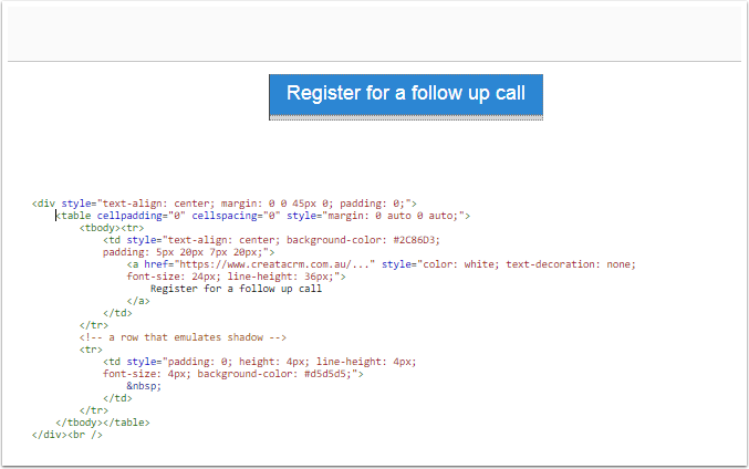
No-Graphics Buttons
Avoid using graphics for my "call to action" elements, Again, I say Avoid. There is 2 major reasons
- Images down render by email client unless the recipient explicitly selects "Download Pictures"
- Too many images, can junk the email.
The ideal what is is to emulating the button, constructing it from text with custom background color, padding and, possibly a border.
This all fits into what I just described in the previous section, we use a . then added a second row to emulate a shadow. Here's how it looks:
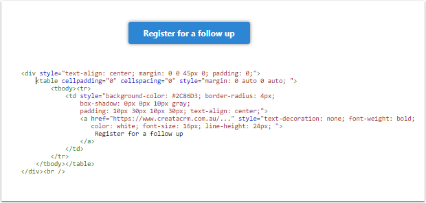
Rounded Edges
You can use CSS3 attributes to apply rounded corners, shadows and other effects. email clients provide sporadic support for this, so you need to keep in mind that certain users will see a stripped down version: a simple colored rectangle with text. Here are my findings:
From 2018 April
- Thunderbird, email clients on Mac, and most mobile clients will display both rounded corners and shadows.
- Most online email clients display rounded corners only.
- Outlook on a desktop will ignore both attributes.
Side-by-side Layouts
When you think about putting two elements on the same level horizontally, especially in an email, you can automatically assume that table columns are your best bet. I, however, we are aiming to build a responsive layout, so a
tag is off the table. Once again, I want blocks to "flow", so I simply place elements one after another, so that they appear next to each other if space permits, or wrap and stack vertically on smaller screens. This basic rule applies to all element types discussed below: images, images with text, and larger content blocks.
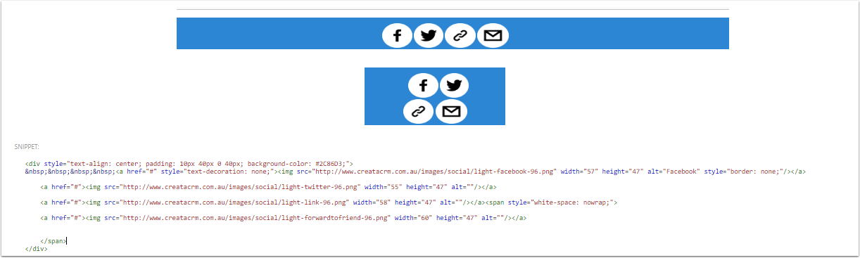
Side-by-side Images
In this section, I'll show you the code for the footer section that displays platform icons.
Here's the explanation:
- The works because:
- (a) the background-color attribute is supported everywhere,
- (b) PNG images have transparent backgrounds that add padding vertically and between images, and
- (c) side padding is only needed on mobile, where is fully supported.
- The code is formatted to avoid white space between tags. This seems to be the simplest way to get rid of spaces between images.
- The that surrounds the last four images prevents a single image from wrapping to the second line.
- border: none; and text-decoration: none; fight the side effects of putting an image into a link.
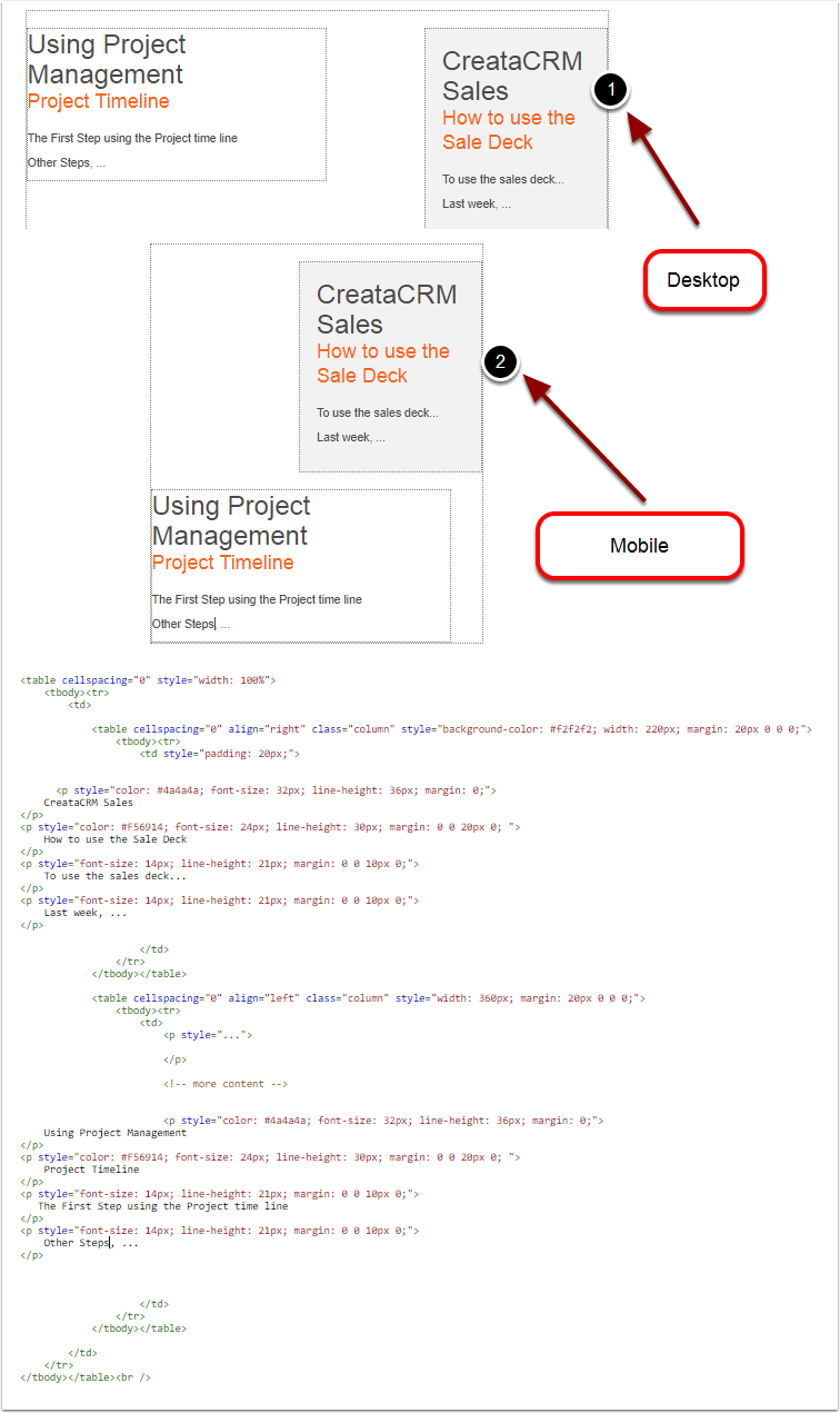
Side-by-side Content Blocks: Building a Multi-column Layout
In this section, I show the code for our newsletter's sidebar, which is displayed to the right of the content on a desktop, or on top of it when viewed on a mobile device.
- Is in Desktop
- Is for Mobile
Following the main theme of this section, I'm simply putting elements one after another, letting them flow and wrap as necessary. In this case, the elements are tags with nested content. I also wrap the tables into a container in order to keep them together and prevent their interaction with preceding and subsequent content.
A few things to note:
- Inner tables explicitly specify width and align attributes. This is key to making the layout flow.
- The sidebar table goes first within the code, and that's why it renders on the top (before) on small screens. But since it sets align="right", it's rendered to the right (after) on a desktop.
- The class="column" part references a media query style that sets the table width to 100% on small screens. See the CSS below. @media screen and (max-width: 640px) { .column {width: 100% !important;}}
You can easily extend this example to achieve a multi-column content layout.
Text and Paragraph Formatting
example Above
As I explained above, I usually put text into tags with margin attributes that control vertical spacing. An exception to the rule is when a table cell contains a single block of text, in which case I put the text directly into a . Regardless of which tag contains the text - or <td> - the same tag defines text formatting attributes, which include the following.
- font-family
- font-size
- line-height
- color
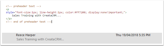
Preheader: Message Preview Text
In all of our email templates you'll see the following sections, which go above all other content.
As you can see, all applied styles are just different ways of saying "hide me". I start with a display: none; attribute, and if that doesn't work, the text is colored to match the background. font-size and line-height are both set to 1px to ensure minimum influence on the layout.
Although my message's audience will not see that text, email clients will fetch it to display in the Message Preview section, which is a great way for me to sum up the content thus motivating the recipient to read more.